Background on lead at: publiclab.org/lead
Overview
Quite a bit of public data exists now that, if brought together, can paint the picture of lead exposure within neighborhoods across the country. This information is useful to a couple audiences: Concerned citizens can see what their risk is; this is general. More specifically and strategically: Community scientists and activists can prioritize where they work. And Public Health officials can prioritize where they work.
There are a few efforts out there, but much of it is local (particular to one city and/or state), or is incomplete or due for an upgrade. We’re seeking data scientists, epidemiologists, and GIS folks to build on these efforts.
The output is a simple map with lead risk scores presented by a geographical unit (census track, neighborhood, etc). The effort should be done in the open and documented (presumably on github, but maybe also here on publiclab.org).
If this is interesting to you, let us know and we can figure out how to work together.
The following are examples of work in this area. Each is useful and has strengths but (I think) insufficient.
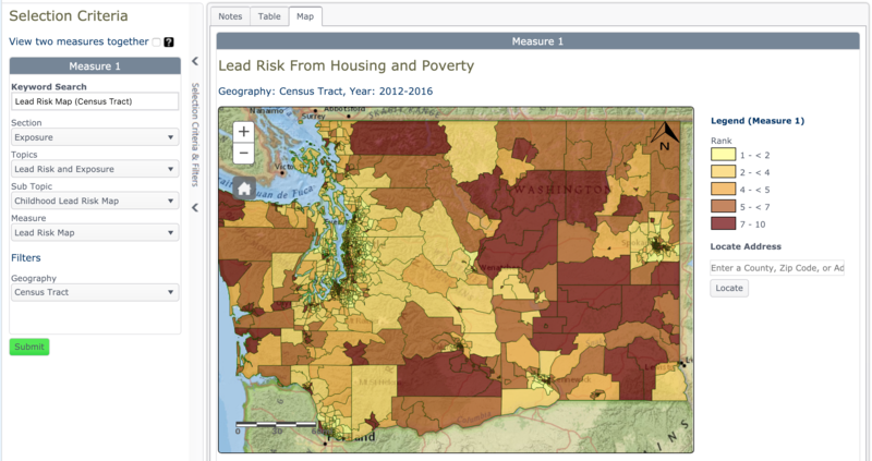
Example 1: Washington State Department of Health

Source: https://fortress.wa.gov/doh/wtn/WTNPortal/#!q0=4718
Childhood Lead Risk Map For this measure we combined two variables: Percent people living below the 125% Federal Poverty Level (FPL) and Percent Housing built before 1980 (and weighted by era built).
Information About the Data In addition to the census of every U.S. household every 10 years, as required by the U.S. Constitution, the Census Bureau has a sub-sample, yearly survey called the American Community Survey (ACS). This representative sample-based survey gathers characteristics for a subset of the entire population of the U.S. each year.
You can find supporting documentation on code lists, subject definitions, data accuracy, and statistical testing on the ACS website, Data and Documentation section. You can find sample size and data quality measures (including coverage rates, allocation rates, and response rates) on the ACS website in the Methodology section.
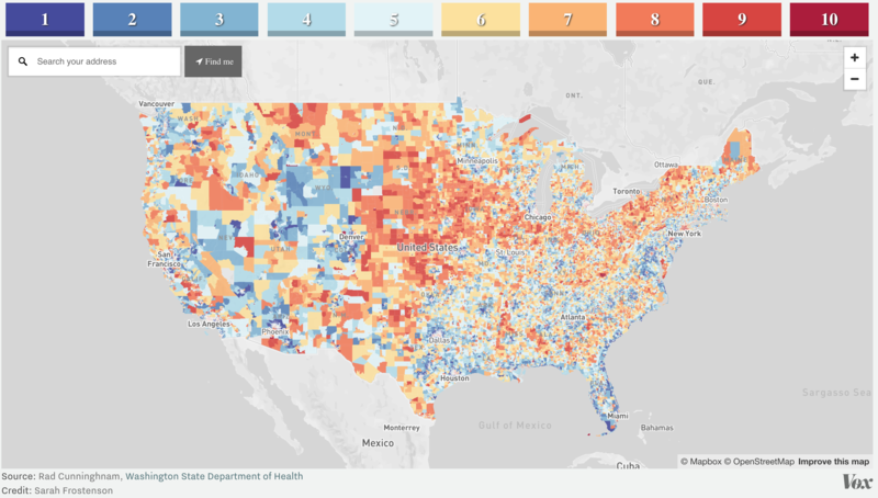
Example 2: Vox (with Washington State Department of Health)

Source: https://www.vox.com/a/lead-exposure-risk-map Github: https://github.com/voxmedia/data-projects/tree/master/vox-lead-exposure-risk
From the article: “The trouble is that exposure risk is surprisingly difficult estimate, due to a variety of state-by-state differences in reporting standards. So we worked with epidemiologists in Washington state to estimate risk levels in every geographic area in America…
Our map uses a methodology that Washington State’s Department of Health pioneered earlier this year to estimate kids’ risk of lead exposure in different neighborhoods. Their mission was to determine how to focus scarce public health dollars on the kids most at risk of being poisoned by lead. We worked with one of the chief epidemiologists who created the map, Rad Cunningham, to replicate the state’s methodology nationally and apply it to all 72,241 census tracts in the United States.”
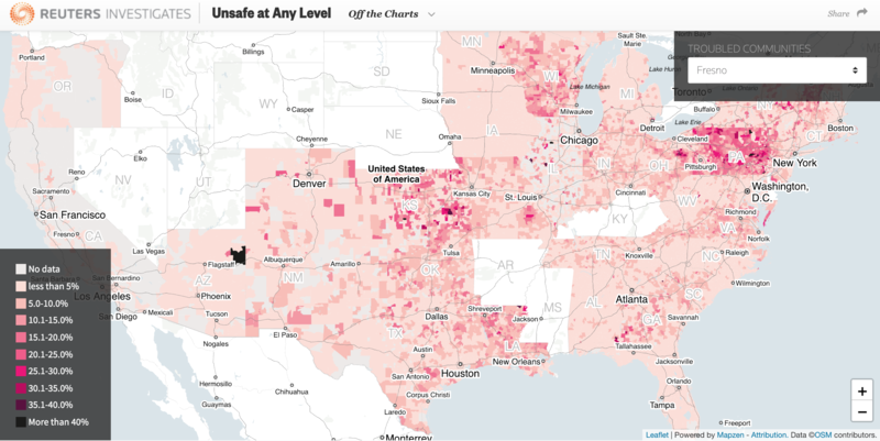
Example 3: Reuters

Source: https://www.reuters.com/investigates/special-report/usa-lead-testing/#article-off-the-charts
From the article: “Most U.S. states disclose data on the percentage of child blood tests that show elevated levels of lead. Yet this data, often for statewide or county-wide populations, is too broad to identify neighborhoods where children face the greatest risk.
Instead, Reuters sought testing data at the neighborhood level, in census tracts or zip code areas, submitting records requests to all 50 states.
U.S. census tracts are small county subdivisions that average about 4,000 residents apiece. Zip codes have average populations of 7,500. In each area, a relatively small number of children are screened for lead poisoning each year.
Reuters found 2,606 census tracts, and another 278 zip code areas, with a prevalence of lead poisoning at least twice Flint’s rate."
If you're a data guru, GIS epidemiologist, or just someone who wants to contribute to this effort, post a comment below or reach out to Read Holman at read@publiclab.org. Thanks!
7 Comments
Related convo: https://publiclab.org/questions/sagarpreet/07-01-2018/what-more-data-layers-can-we-show-on-map#
Reply to this comment...
Log in to comment
Hey Read! I'd be happy to help y'all get your data mapped - I'm a little too swamped to do much as far as data management, but I think I can be of help converting tabular data to spatial, and possibly building a web app to display it using ArcGIS online. Please loop me in on future conversations!
Reply to this comment...
Log in to comment
Combining these into one map should be pretty straightforward with Leaflet Environmental Layers -- a project we've developed with @sagarpreet!
https://publiclab.org/notes/sagarpreet/06-06-2018/leaflet-environmental-layer-library
You can read more at @sagarpreet's profile, and we should discuss opening an issue on the LEL github project for these layers.
A couple quick queries - first, are the layers above publicly usable? I'd assume so, with attribution?
Second, do any of the layers listed on LEL (currently) seem useful to the subject of lead?
Is this a question? Click here to post it to the Questions page.
Reply to this comment...
Log in to comment
Just to expand on this, LEL is designed to be a common, standard back-end to present a lot of these layers on the same interactive map with minimum code. It does not have a huge UI component, and that's both something we assume a given website would build out, AND/OR something we're hoping to help provide within the library as it grows. It'd be great to co-imagine what kind of interactivity the data would have -- would it have popups? Would it open related resources, articles, links, display nearby projects... when browsing through different regions?
Is this a question? Click here to post it to the Questions page.
Reply to this comment...
Log in to comment
Mapping lead risk vs measured lead levels is a choice that requires describing a methodology and calculating scores beyond plotting data on a map. Is there documentation of the method mentioned above that was pioneered by Washington State’s Department of Health?
Is this a question? Click here to post it to the Questions page.
Reply to this comment...
Log in to comment
I found this pdf when considering water quality and tests
http://aesl.ces.uga.edu/publications/watercirc/TestingWaterQuality.pdf?2
Is this a question? Click here to post it to the Questions page.
Reply to this comment...
Log in to comment
Good point @liz - there are equations for determining risk based on exposure routes and factors, population characteristics (ie- age) and known total concentrations of lead. A clear methodology would be good because total concentrations don't give a good estimation of risk- perhaps NHANES or the Washington State Dept of Health would share their methodlogy? I tried to look into the Washington State Depts methodology for creating the lead exposure map you asked about, and interestingly they also have info about other contaminants. Their methodology seems to be based on bioinformatics on urine samples of the population.
Is this a question? Click here to post it to the Questions page.
Reply to this comment...
Log in to comment
Login to comment.